


An Eighteenth-century Tibetan Sketchbook, Salvador Dali’s India Connection and a Typeface Conundrum

Instructions on drawing the perfect Buddha, a surreal ashtray for Air India and a Buddhist manuscript with three script options – Welcome to our corner, readers!
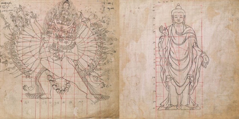
How to Draw the Buddha and Other Perfect Beings: An Eighteenth-century Guide Book from Tibet
Ever since the 3rd century CE, when the Buddha was given an anthropomorphic form, in Gandhara and Mathura, likenesses of the Buddha have been created in stone, in stucco, on walls, on cloth and on paper. His form has morphed and changed — along with those of the multiple bodhisattvas, demi-gods, and creatures that populate Buddhist iconography. How would you draw the Buddha? Look no further for instructions — we found a guidebook!
While researching Nepali and Tibetan thangkas, Simran Agarwal stumbled upon a rare eighteenth-century Newari-Tibetan manuscript, which had strict instructions on the perfect rendition of the Buddha and bodhisattvas. In Buddhist traditions, the idea of perfecting the self over several lifetimes through renunciation and ascetic practice plays a pivotal role in transforming oneself from a bodhisattva to a Buddha. This perfection not only includes perfect conduct and inner beauty — associated with qualities such as insight, generosity, truthfulness and kindness — but physical beauty as well.
According to the Pali canon, there are thirty-two physical characteristics, or lakshanas, that help identify a great man, such as ox-like eyelashes, gracefully-elongated arms and a set of forty seamlessly aligned teeth. This meticulously-crafted manuscript uses thirty-six ink drawings to illustrate these characteristics. Develop your artistic skills in sketching the perfect Buddha and bodhisattvas with the help of the digitised version of this unique manuscript.
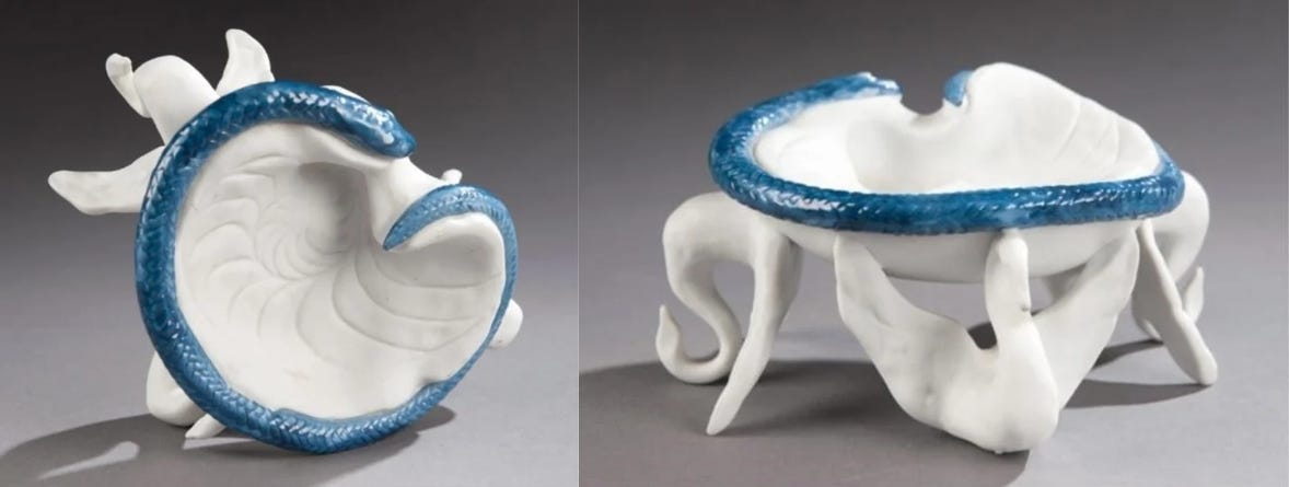
Skybound Surrealism: When Air India’s Flight Path crossed Salvador Dali’s Imagination
There has been a growing trend of collaboration between airlines and luxury brands in the fields of food, design and fashion — from Singapore Airlines’ Lalique sleepwear and EVA Air’s Hello Kitty-themed aeroplane bodies to Delta’s partnership with the legendary New York-based restaurateur Danny Meyer. However, long before such collaborations became a known formula to win over passengers, Air India had forged what is perhaps amongst the most interesting partnerships in aviation history.
While reading about air travel in post-Independence India and airline advertising, Shrey Maurya learnt about a chance encounter between Jot Singh, the public relations officer of Air India, and the surrealist artist, Salvador Dali, in 1967, New York, which resulted in Dali designing an art object for the airline. It was a limited-edition, porcelain ashtray featuring two elephant heads, a swan and a central shell, bordered by a blue serpent. Viewed from an inverted angle, the elephant heads appeared to be swans and the swan presented itself as an elephant head — a visual illusion commonly encountered in Dali's surrealist paintings.
Dali’s fee request was as surreal as his artistry — not land, not money but an elephant! Unfortunately, the elephant eventually ended up in a Barcelona zoo — being a pet parent is a fulltime job and Dali did not seem to be aware of that — and the ashtrays probably ended up in private collections.
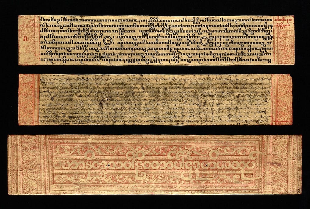
Typefaces, Three Ways: Exploring a Burmese-Pali Manuscript of the Theravada Tradition
Have you ever struggled with selecting a font while preparing a document, making a presentation or designing a webpage? Georgia appears too formal; Calibri is too simple; Copper Black is too ornamental – the options can be overwhelming. We’re caught in limbo, suspended between the desire to be legible, whilst indulging in our desire to appear beautifully presented.
Turns out this conundrum has a long and ancient history. While researching Buddhist visual cultures, Mustafa Khanbhai discovered an undated Burmese-Pali manuscript of the Mahaniddesa — an early Buddhist scripture within Theravada Buddhism — depicting two different scripts. The upper script features Burmese writing referred to as the ‘tamarind-seed’ or ‘square’ script, while the second script displays the more popularly recognised round Burmese characters. Unsatisfied with either, the writer included a third script — the most ornate of them all — with thick red, rounded outlines, between horizontal columns of scrolling red vines, on the inner face of one of the manuscript’s gilded jackets.
While multilingual inscriptions in India were common, — as seen in the bilingual inscriptions of the Mauryan emperor Ashoka — manuscripts with multiple typefaces were a rarity, which is why one can only wonder about the intention. Perhaps it was the Sangha’s attempt to diversify its readership in an atmosphere of religious competition? Maybe these leaves belonged to three different editions? We don’t have an answer yet, but this image did inspire us to read more about two things — the Buddhist Pali canon to which the Mahaniddesa belongs, as well as Burmese manuscripts, a number of which we found in the Wellcome Collection.
We hope this list has inspired you to do some research of your own — if you have recommendations you would like to share with us and our other readers, do comment below!
Excellent post